Illinois
TRANSFORMING CLASSIC ARCHITECTURE WITH MODERN ELEGANCE AND FUNCTIONAL EXPANSION.
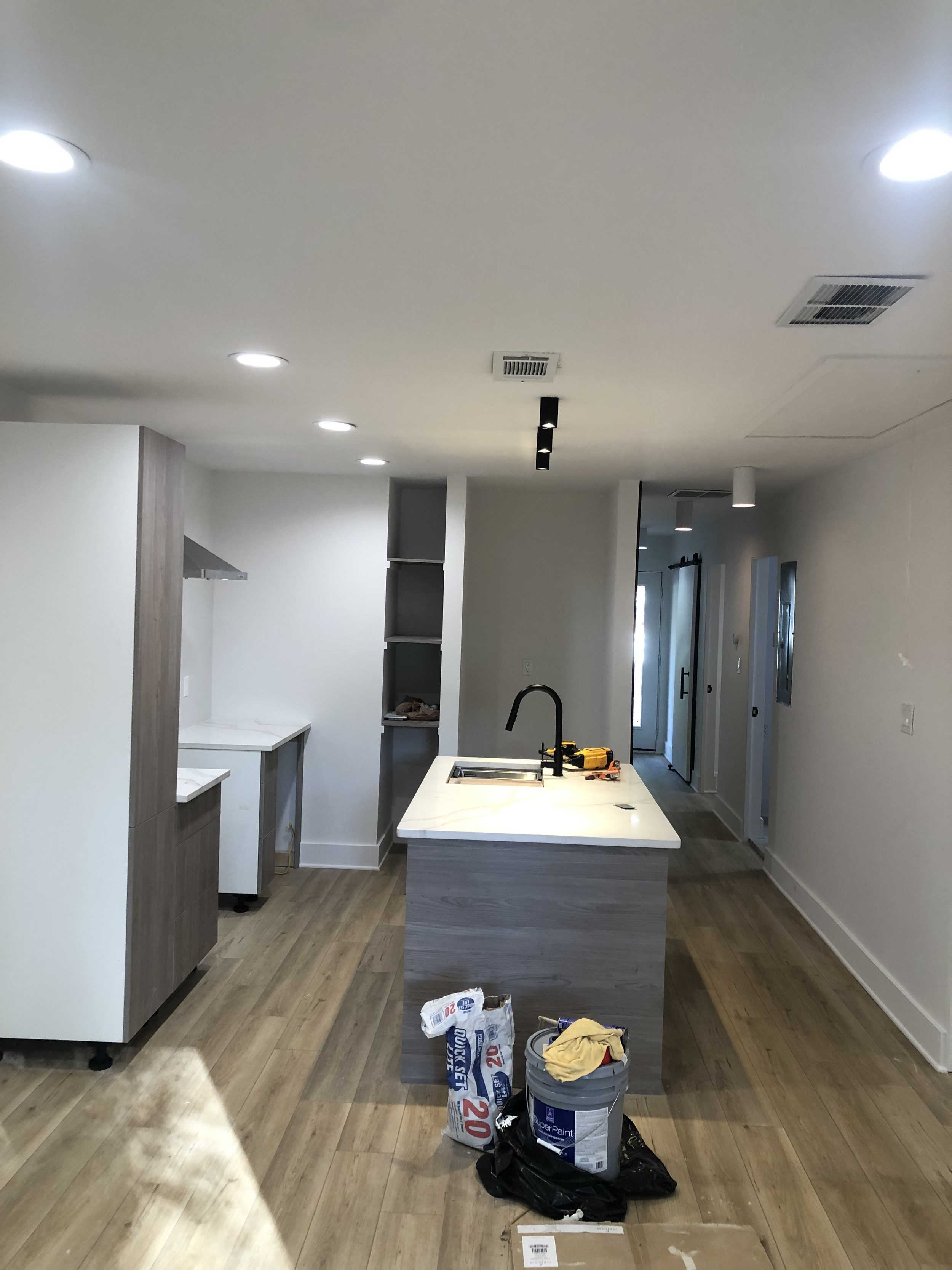
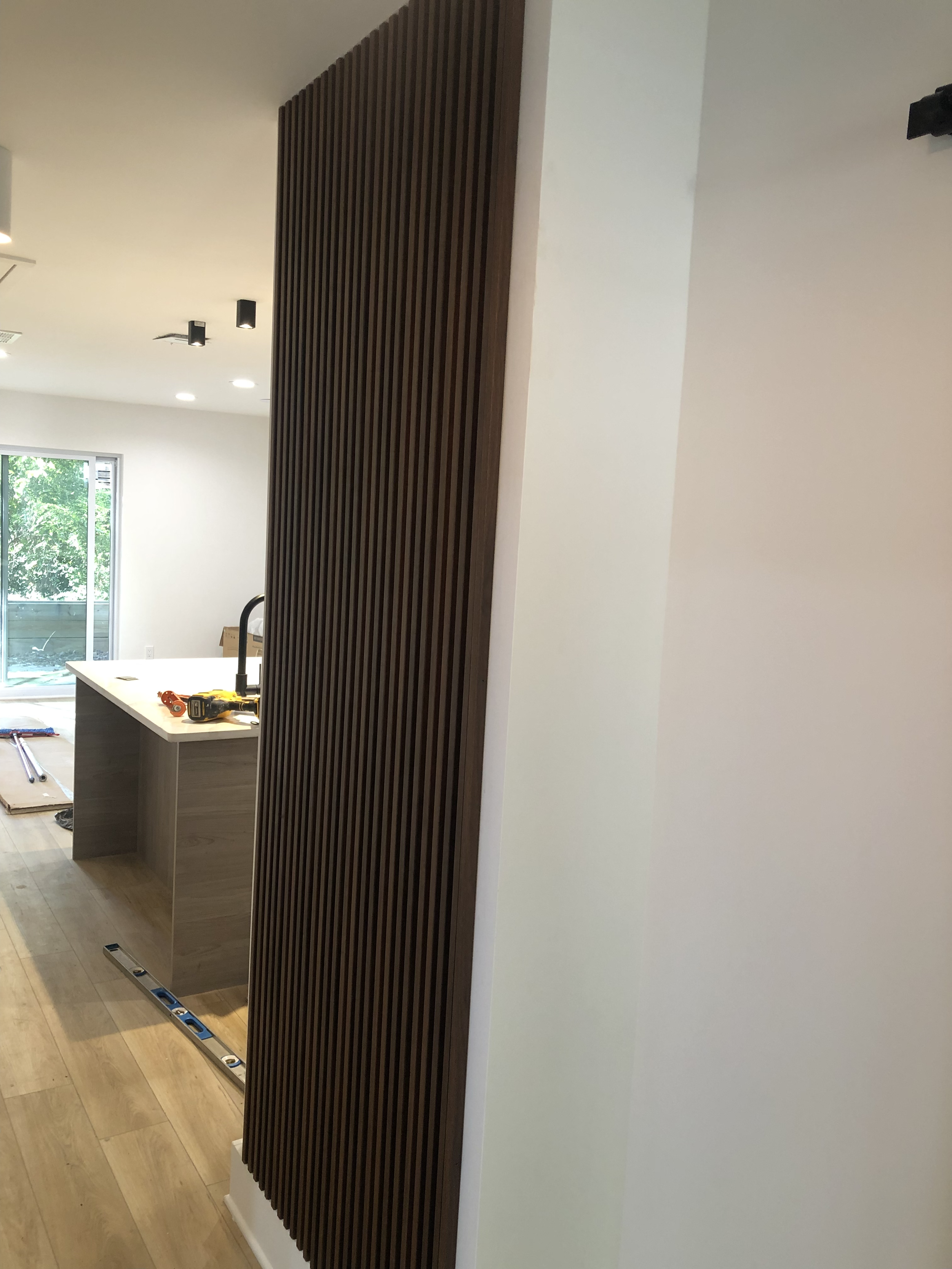
A seamless blend of classic and modern design, the McLinden remodel revitalizes a 1960s stone-clad home with a functional expansion, drawing in light and introducing contrasting materials. The transformation preserves the original charm while elevating the home with contemporary details and enhanced living spaces.
OUR SERVICES: Site Feasibility // Programming // Concept Design // Design Development // Interior Design // Construction Documents // 33Nest Property Design and Build
ILLINOIS
Location: GROVE PARK, GEORGIA
Developer: PRIVATE
Status: COMPLETE
Estimated Completion: COMPLETE
Presentation: Illinois Project Summary


INITIAL CONCEPT EXPLORATIONS
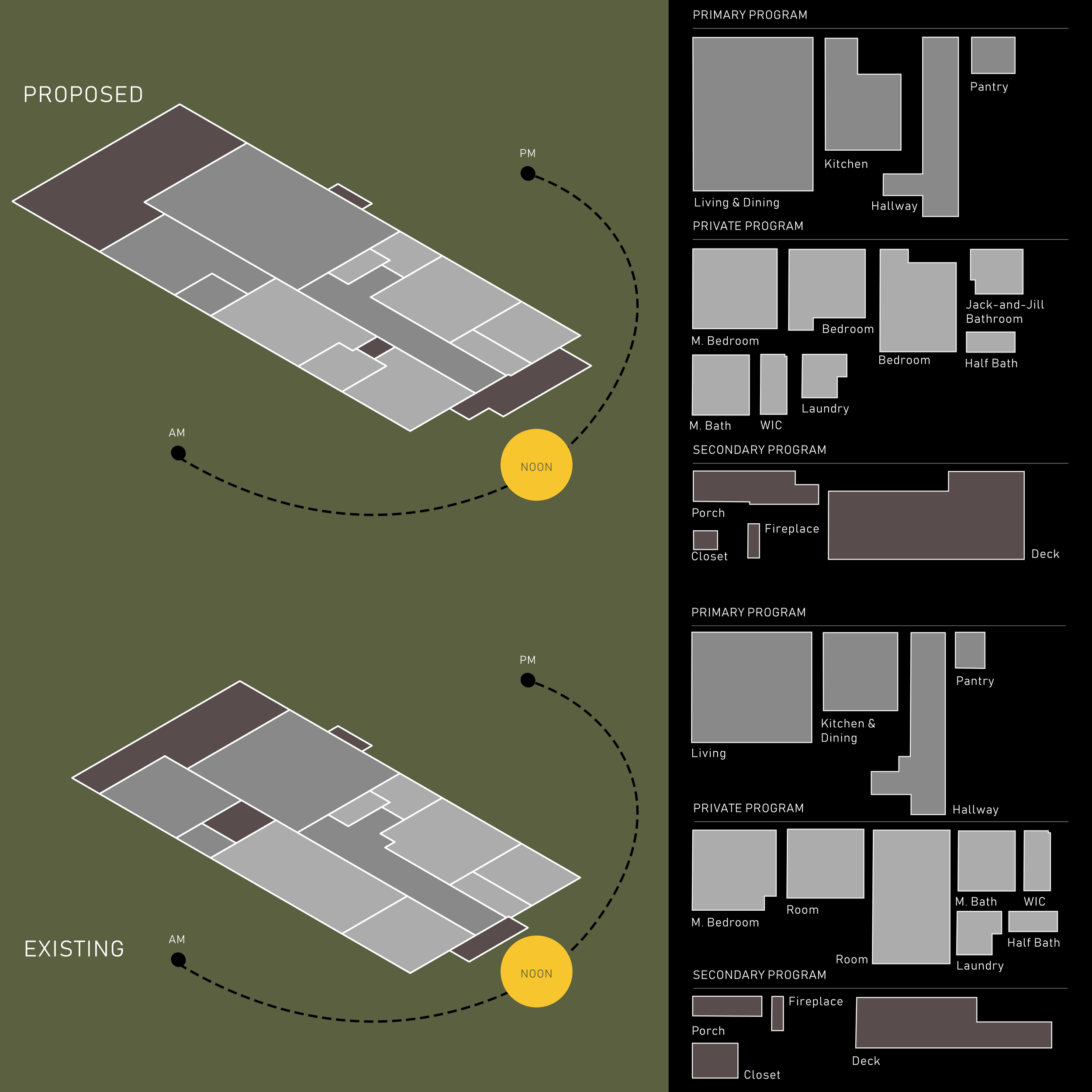
At the beginning of the Illinois remodel project, we explored three different concept layouts, each aimed at maximizing the space and improving the flow of the home while balancing the needs of the investor for long-term rental viability.
Concept 2: In this version, we introduced a more fluid open plan, completely removing any hallway to create a larger, uninterrupted living area. The kitchen became the heart of the home, centrally located between the living room and dining areas. This layout opened up all bedrooms to the rear of the house, creating a sense of separation between the public and private spaces. It was a more contemporary approach, with an emphasis on communal spaces for gatherings and modern living.
Concept 1: This layout proposed keeping the living and dining areas toward the front of the house with an open connection to the kitchen, maintaining an existing flow but enhancing it with better sightlines and a sense of openness. The master bedroom was relocated to the back, providing more privacy, while the main bathroom remained central, easily accessible for all occupants. This configuration aimed to maximize natural light, particularly in the living space, while maintaining a simple, functional layout that renters would appreciate.
Concept 3: This design focused on optimizing storage and utility spaces while keeping the main areas open. The layout preserved the traditional distinction between rooms but introduced better connections and flow, allowing for flexibility in how the space could be used. Bedrooms were spread more evenly across the home, and an extended laundry/pantry room was added for better functionality.
After multiple discussions and feedback from the client, we evaluated the strengths of each concept and ultimately selected Sketch 3 as the final design. This layout offered the best balance between enhancing natural light and improving spatial connections, particularly through the open-plan living and kitchen area. Additionally, Sketch 3 optimized the functionality of storage and utility spaces while creating a clear distinction between public and private areas. This solution not only aligned with the client’s vision but also catered to the long-term needs of future tenants. This collaborative process allowed us to refine and perfect the design before moving forward with construction.
ILLINOIS
2023 / COMPLETE / SINGLE-FAMILY/ ATLANTA, GA / RESIDENTIAL / 1,100sqft


